REFWeb
Improving usability of the Microsoft office campus websites in San Francisco
BACKGROUND
The mission for REFWeb, a Microsoft intranet through their SharePoint platform, is dedicated to communicating important and relevant information regarding their offices and providing employees with rich and engaging resources. Its website, however–the primary way its SF sites connect employees with office information—was failing its mission and the users it serves. Many employees preferred to not utilize this resource as many had found the website difficult to navigate and information not relevant to their needs.
OBJECTIVE
Improve discoverability within the SF Microsoft campus portal, allowing users to easily find key information
Increase user engagement on the site so employees utilize it as a resource
IMPACT
Improved user success rate navigating the site by 81%
Increased overall site traffic by 85% within four months of launch
TASKS
User Research, Analysis, Information Architecture
TOOLS
SharePoint, Optimal Workshop, Figma, Miro, Teams
TIMELINE
5 Weeks (80 Hours)
MY ROLE
Lead designer
01 DISCOVERY
Starting with a Platform Assessment
To improve the organization of the website and discover possible user pain points, I started with an in-depth assessment of the platform’s current state. This allowed me to identify possible usability problems and pain points in the user flow.
I realized that the user experience offered on the site was confusing and overwhelming. The major pain points I came across were the overwhelming number of navigation items and confusing content organization. I also noticed UI inconsistency across the design and a lack of information regarding visiting the site.
Speaking with Users
After assessing the current system, I needed to validate my own assumptions and observe how users were navigating the site. I conducted seven thirty-minute user interviews both in-person and remote via Teams. Since I wanted to get a wide perspective on this, I set out to interview Microsoft employees who have been long-assigned to this office, those who are recently new to the office, and those just visiting the site. They were asked a series of questions, followed by a few tasks to evaluate the findability of information.
My research objectives were:
Learn how users currently find office-related information
Understand what drives users to the REFWeb
Observe how users navigate the site
Understand what content is most important to users
Discover user pain-points
Findings
All participants were unable to successfully locate the correct page on each task in their first attempt
Users usually jumped around 3-4 tabs looking for the correct page
Users started from the top navigation menu to find what they were looking for
Users were mostly interested in using the REFWeb to learn information on visiting a different office location
Users want to use the REFWeb as their one-stop-shop for all questions related to the office
Auditing the Sitemap
After speaking to users, I wanted to map out the information architecture to reach inside the issue and get a clear visual overview of the current IA. This allowed me to understand just how much content lives on the site and get a bird's eyes view of what pages can be possible merged or deleted entirely.
As we can see below, the REFWeb has a flat hierarchy—which is typically great at keeping clicks to a minimum—but when a website (like in our case) offers too many categories to show at once, it often results in additional clicks and errors from the user having a lack of clarity. The current navigation goes as wide as 14 categories, which makes it difficult to find information and leads to content that is overlapping and duplicated. To add to this, many of the categories are not very distinct from one another and many of the labels are pretty ambiguous which only adds to users’ confusion.
Consolidating this navigation menu to about half, logically grouping similar information, and introducing clear labeling would add some much-needed simplicity and clarity to the navigation and improve the overall users’ finding experience.
Testing the Findability of Information on the Current Sitemap
To dive even deeper and evaluate the findability of information on the existing sitemap, I created a treejack test. Users were given a set of 10 tasks to complete related to the office website.
An example of a task: “You’re visiting this office, where would you find information about printing?”
The key performance indicators (KPIs) that were created for this project and are being validated in this test include accuracy, speed, and directness.
KPI Results:
48% success rate across all tasks
87% directness from participants (without backtracking)
4 minutes 16 seconds was the median time to complete the study
-
Only one task had a 100% success rate (finding lunch menus)
Only two tasks had a success rate of 80% or higher
Half of the tasks had a 50% success rate or lower
One task had a 0% success rate (COVID guidelines)
The results tell me there’s lots of room for improvement on the overall information architecture—especially on the content with the very low success findability rate.
-
COVID guidelines — 0% success
80% of people expected it under Health & Safety
Events – 10% success
People expected to find it in 10 different areas
Most popular were: Services, Facilities, & Contact Us
Office Supplies – 30% success
People expected to find it in 4 other categories
Most popular were: Services & Building Features
Printing – 40% success
Users chose “Features”, “Facilities”, or “FAQ” equally
First Aid Kits – 45% success
People chose 5 different categories for this.
Most popular expected to find this under “Health & Safety” (50%)
Creating a Card Sort
To avoid making any assumptions on the users’ behalf, I conducted an open card sorting activity among 20 participants. This was extremely valuable as it allowed me to get into the minds of the users and see how they organize information into categories that make sense to them. I also observed some of the participants in person while they did the activity to allow me to uncover additional behavioral insights into their decision-making.
Based on the data below, I could see very strong patterns and categories forming—especially in those groups with a high percentage agreement rate.
Findings
5 categories was the median number created by participants
100% of people grouped Printing, Office Supplies, and Mailroom
92% of people grouped IT contacts, Facilities contacts, and Facilities Requests
92% of participants grouped Building Amenities and Dining
83% of participants grouped Building Amenities, Dining, and Events
83% of people grouped Transportation, Parking, and Biking info
83% of participants grouped Visitors, Reserving workspaces, and badge access request

02 DEFINE
Creating a new Information Architecture
With the useful insights I’ve gathered and my card sort results, I moved on to designing a new information architecture for the site.
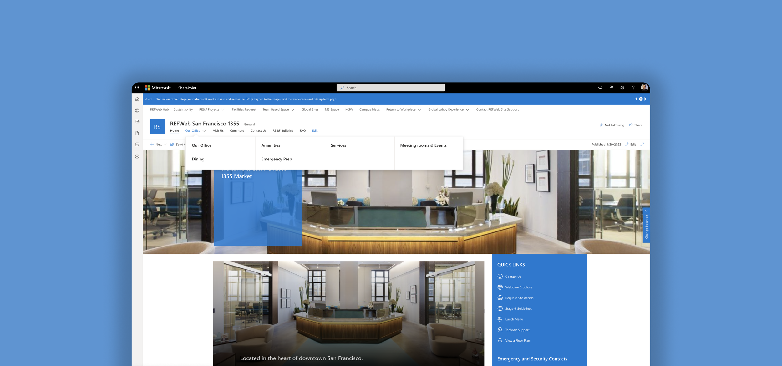
I reorganized and consolidated the navigation menu down to 7 categories (from 14) by merging similar pages together, grouping several pages into a common category, and adding a drop-down to the navbar. I also ensured the labels are clear and titled in a way that reflect the language of the user to remove any ambiguity.
Validating the new IA
After designing the new sitemap, I went back to conducting another round of a tree test to evaluate the findability of information on my proposed information architecture.
An example of a task: “You’re visiting this site, where would you find information regarding the office mailroom?”
The key performance indicators (KPIs) I was interested in validating again were: accuracy, speed, and directness.
KPI results:
87% success rate across all tasks
85% directness from participants (without backtracking)
3 minutes was the median time to complete the study
-
We saw an 81% increase in the success rate (from 48% to 87%)
We saw the directness slightly decrease by 2% (from 87% to 85%)
Participants were 29% faster in their decision making
-
Finding information about printing went up from 40% to 80% —100% incr.
Finding information on our first-aid kit went up from 45% to 70% — 56% incr.
Contacting an IT specialist went up from 60% to 90% — 50% incr.
Finding information on the office mailroom went up from 50% to 70% — 40% incr.
Finding information on the emergency exits went up from 75% to 100% — 33% incr.
Finding parking information went up from 65% to 85% — 31% incr.

03 IMPLEMENT
Implementing the new IA
With the successful results from the tree test, I was ready to implement the new IA to the site.
In addition to the new navigation, I gave the site a clean up from the overwhelming amount of information it had, tackled some of the UI inconsistencies, added new content that was critical to users (like instructions on how to visit the site), and made the information that was high on their priority list more accessible.
04 TESTING
Usability Testing
After implementing the new information architecture to the site, I conducted usability tests to gather some more user feedback on the new navigation. I interviewed 6 participants which were asked to explore the website, as well as complete a small series of tasks.
My objectives were to validate the new IA, gather behavior insight from users, and discover any pain points users may face.
Findings
6/6 participants were able to easily achieve all given tasks on the first take
6/6 participants had a positive reaction to the changes made to the website
5/6 mentioned that the labels were clear and easy to understand
3/6 participants mentioned Amenities and Services were very similar and could possibly be merged
3/6 participants felt information on the first aid kits could live in a few places
Overall, users were able to quickly scan and easily orient themselves on the navigation menu
CONCLUSION
Reflecting on REFWeb
In this project, I discovered the large role information architecture plays—not only in the digital screen but in everyday life. I started analyzing the environment around me and questioning the decisions taken to connect us with information.
I was constantly reminded throughout the project that I am not my users nor do they think exactly like me. I continued to validate my assumptions throughout my process to ensure I was working with the expectation of my users and not just my own. Directly speaking with people and observing them as they navigated the site allowed me to better understand why and how they were using the REFWeb and the pain points they were facing. I also explored new methods for this project, which I found extremely valuable in helping me dive deeper into the behavior and decision-making of my users.
Lastly, simplicity and clarity goes a long way. The old IA intended to help users find information faster by laying all the content out at once but caused more harm than good. Too many choices overwhelmed users and finding information actually required more time and effort. I realized that speed came from clarity and by simply reducing the number of options presented at once, users were able to quickly orient themselves and take faster action.