Kaus Insurance
Simplifying the user experience for auto-insurance purchasing
PROBLEM STATEMENT
Kaus is a large company with 30 years of experience in the insurance industry. Since their early beginning, they have sold their insurance policies to customers through regional agents. However, with the rise of technology, they’ve begun to lose ground with younger Millennials and Gen Z. Kaus is now looking to update their business model for this new age and move their business online to directly serve customers in an effort to capture this younger demographic and remain competitive against newer companies emerging. (Speculative project)
View Prototype →
TIMELINE
5 Weeks
(80 Hours)
MY ROLE
UI/UX Designer
(Solo)
TOOLS
Figma / Optimal Workshop
Maze / Photoshop
TASKS
UI / UX Design, User Research, Branding, Prototyping, Usability Testing
How might we help Kaus increase its online presence and improve the current user experience with finding auto-insurance online?
THE SOLUTION
An end-to-end responsive design that streamlines users’ shopping experience for insurance
I proposed to design an e-commerce website that is pleasing, trustworthy, and easy to use while also streamlining the users’ experience in purchasing auto insurance. I also refreshed the Kaus brand to give it a modern aesthetic that would help appeal to a younger market.
And here’s how I got there:

01 RESEARCH
Creating a Research Plan
To take the project in the right direction, I created a research plan to define some of the projects’ goals, objectives, and methodologies. This document helped guide the research process and keep myself focused on designing for the right problem.
-
Goal
Understand the relationship customers have with insurance and what influences their purchase decision
Objectives
Discover what users value in an insurance plan
Identify why users choose one auto insurance over another
Understand the pain points users are experiencing with online insurance shopping
Discover competitors’ strengths and weaknesses
-
Market Research
Competition Research
User Interviews
Card Sorting
Researching current market and user trends
I started my design process by conducting market research to get a better understanding of the industry Kaus exists in and discover general trends in insurance.

Discovering strengths & weaknesses of existing competitors
Conducting a competitive analysis allowed me to better understand how other companies are currently solving the problems existing in the market and provided some insight into what users may be expecting from insurance websites.
For this, I attempted to get a quote from three of the biggest players in the market and one that’s relatively new.
View Full Competitive Analysis →
-
I quickly realized that most experiences offered on the market today are not very user-friendly and are generally very confusing and frustrating for the user to find the right coverage—especially for those who are not familiar with the topic. Other things I noticed were: many steps and screens to obtain a quote, most did not offer a chatbox and most displayed their price in a “6 month total” instead of a monthly cost.

User Interviews: Identifying users’ pain points and motivations
I reached out to my personal network of friends, family, and coworkers to participate in my interviews. I interviewed a total of 5 participants to discuss their experience with buying insurance (both offline and online). They were all virtual and lasted 30 minutes long, consisting of mostly open-ended questions.
View User Interview Analysis →
Key Takeaways:
-
After speaking with participants, I discovered that many lack the confidence and knowledge needed to make a confident decision in insurance coverage. A lack of clarity and confusing verbiage contributed to users feeling frustrated and discouraged to finish the insurance process. Many mentioned that understanding policies felt like a hurdle and the need to understand their coverage is crucial to finishing the purchase.
Users want to feel confident and informed in their insurance decision, they expect to easily find reliable answers to their questions and support to be readily available whenever needed (in various forms).
-
Generally, participants have a negative opinion of insurance companies and described their experience of insurance shopping to be tedious, overwhelming, and time-consuming.
Young millennials want a speedy insurance process, readily available support and resources, personalized coverage, and a website that’s easily navigable.
Any opportunities to excel in these categories should be prioritized to help improve the users’ experience and build user trust.
-
All participants were concerned about price when it came to auto insurance. Few of them even mentioned they’re only getting coverage because it is required by law. Many participants felt they have been overpaying for their coverage and would be interesting in switching to a different provider if they provided lower prices for the coverage they need.
Customers are also concerned about insurance companies and their lack of clear and transparent pricing, they want to know what they’ll be paying upfront (without hidden fees) and what is covered in their plan.
Overall, participants are concerned about finding the best price for the coverage that fits their unique needs.
02 DEFINE
Creating the persona: Meet Mariah Garcia 👋
After synthesizing the data from my interviews, I had a clear understanding of users’ motivations and needs and was ready to brainstorm solutions to users’ problems.
I created a persona based on the people I interviewed, this helped me gain empathy for the user and ensure my design decisions were based on their needs and goals while building the product.
Empathy Map
After creating my persona, I created an empathy map based on patterns I uncovered from my user interviews. This helped me view things from their perspective and gain a deeper insight into what users may be looking for in the product.
INFORMATION ARCHITECTURE
Card Sorting
I conducted an open card sorting among 10 participants using Optimalsort. The exercise contained 20 cards, each labeled with a feature that would be necessary for Kaus to provide. Each participant was asked to group these cards into categories that made the most sense to them. Analyzing the findings from this exercise provided powerful insight into how users categorize and classify information and how best to organize the IA of the site.
-
Most participants grouped cards into 4-5 categories. The most common categories among participants were:
Our Products: 80% of participants
Account: 70% of participants
Support: 60% of participants
Learn More: 60% of participants
About Us: 50% of participants
Site Map
After discovering how users categorize insurance information, I mapped out the features that would be most important to the Kaus website and organized them in a way that would allow for easy navigation. This served as the blueprint of the website and helped me visualize the layout and hierarchy of the content.

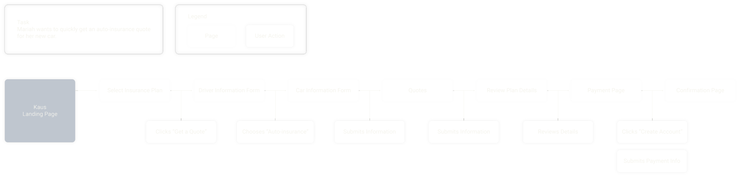
Task Flow
Following the sitemap, I explored user/task flows relating to the process of finding a quote.
The task flow below showcases the quickest way a user can receive a quote for auto-insurance and complete their purchase. This helped me narrow my focus to the actual steps needed for a user to complete their task and ensure I’m meeting the users’ goal of a quick quote process.
User Flows
User flows were then created to map out the various ways a user can go through to purchase auto insurance. This includes the different actions and decision points that users may encounter that can impact their path to completion.
03 DESIGN
Early Iteration Phase
Once I had visualized my user flow and defined the key pages, I began sketching potential layouts and explored different directions for the design.
Mid-Fidelity Wireframes
With my pages defined, I started digitalizing my sketches. I created mid-fidelity wireframes starting with the desktop, then moved on to tablet, and mobile. Keeping in mind my persona and the feedback I received from my user interviews, I made sure to design something that felt welcoming and clean—yet also informative and would evoke trust-worthiness from the user.
Creating a UI Kit
For the UI design, I wanted it to reflect and communicate the brand identity of Kaus—clean, modern, playful, and welcoming. It was important to carefully craft each element to align with the brand but also consider how users would interact with the elements. They needed to be consistent, simple, and familiar to the user so they can spend more time focusing on what really matters—finding the coverage they need. With this in mind, I created a UI kit that served as the design guide for the entire website.
High-Fidelity & Responsive Wireframes
After establishing my UI design, I polished my wireframes and applied the established styles to the screens. Bringing it all together to create something inclusive and human-centric—focused on personalization, easy access to support and resources, and clear and concise copy and messaging.
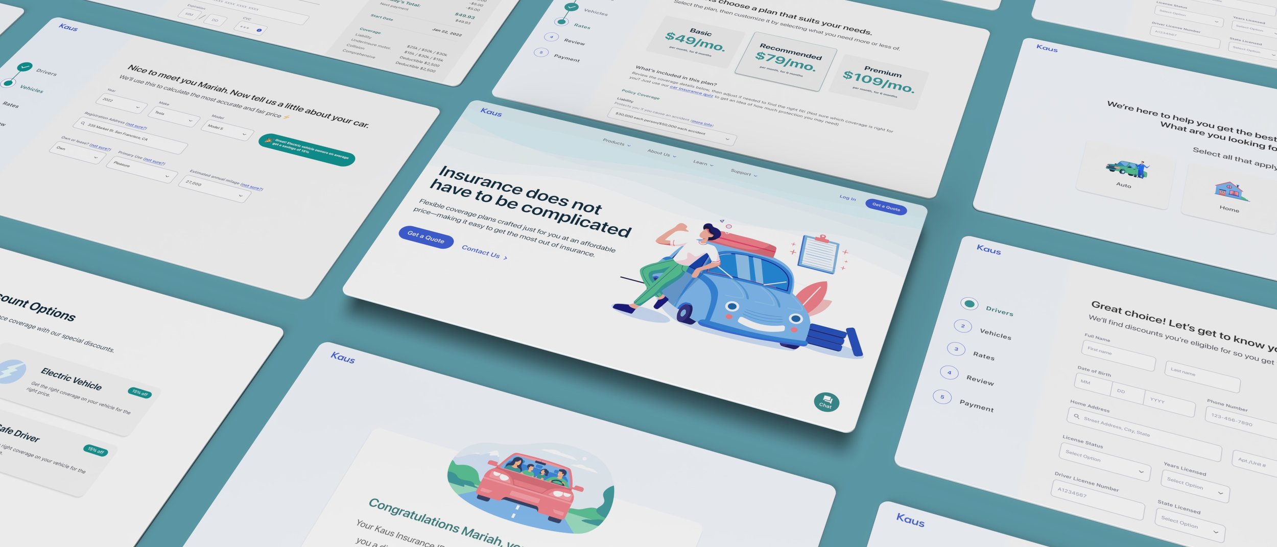
Quote process
Below are some of the key screens users would flow through to complete their task of purchasing auto insurance.

04 TESTING
Usability Testing
I conducted a usability test with 7 participants who fit my target audience and had experience with purchasing auto-insurance either online or offline. These were conducted over the course of 2 days and were moderated in-person and remote. Users were asked to explore the website and complete a purchase of auto insurance coverage. I had each user narrate their thoughts and initial impressions to get a deeper understanding of their behavior and perception of the product.
Test goals
Test the overall quality and user satisfaction of the design
Test how easy getting a quote is and if users are able to complete the task without difficulty
Test how helpful the design was to the user getting auto-insurance
Discover any pain points users are experiencing
Research findings
All users expressed satisfaction with the design, using keywords like “clean, friendly, inviting, and consistent”
All users found the quote process to be “simple, fast, and easy”
100% of participants were able to fully complete the quote process without difficulty. (100% completion rate)
Various pain points were also discovered during these tests (more on this below)
Affinity Map
I gathered this feedback and organized them into groups to make better sense of all this information. I grouped them into two categories: successes and pain points, and then looked for patterns—especially in the pain-points users were facing. This helped me prioritize the areas of improvement that needed to be addressed first.
05 ITERATIONS
Priority Revisions
Priority revisions were made based on my usability test feedback. The changes implemented were:
Move the play button to where users expect to see it to help with affordance
Add number of reviews to help with credibility with users
Make it clearer when buttons are disabled by completing graying out the button
Make all informational popups more affordable and consistent with UI
Add an option to download mobile app
Add affordance to videos
Few participants mentioned they didn’t know they could interact with the video so I moved the play button to where users would expect to see it to facilitate affordance.
Make information pop-ups more accessible and consistent
Few participants mentioned the information in the pop-ups was a bit hard to read so I increased the size of the pop-up (including the content) so it’s easier to read and scan quickly. I also realized there was a bit of UI inconsistency with the popups so I made some adjustments to improve this.
Add clarity to disable features
Few participants attempted to click the ‘Pay’ button during its disabled state without realizingso I completely grayed out the entire button. This will help make it clearer to users that some important information is missing before proceeding.
CONCLUSION
Reflecting on Kaus
Working on the Kaus project gave me the chance to utilize my skills as a user researcher since auto insurance was a topic I was not familiar nor comfortable with to begin with. I learned a great deal about the insurance industry and the relationship people have with it. I learned to put myself in the shoes of the user and view things from their perspective in order to create a design that’s focused on their needs—transparency and streamlining the insurance process.
Continuing to come back to the user throughout my process reminded me of who I was designing for and helped with not feeding into my own assumptions. Testing with users was vital as it allowed me to see how people were actually interacting with the product in the real world—allowing me to see where improvements can be made and where it was successful.